As design trends come and go, so do styles that companies identify by. It’s not often that companies adhere to trends to tailor the way that they identify to their consumer base. This is done to a lesser extent by acclimating to the world around you, so your business stays visually relevant. Slight adjustments are commonly made to better suit the environment you find yourself in, and Vive is a prime example of this.
As 2022 progressed, Vive’s look and feel of what makes Vive, Vive, was completely revitalized. Walking into the year with a stronger team, as well as a refreshed mindset, equipped Vive with all the necessary tools to make the visual changes that were essential to redefining our brand.
Where Did These Branding Changes Start?
Social Media – Color
The changes that happened to our brand were spread out vastly throughout the year, but a large majority of changes were constructed immediately. The first area that was tackled was social media. Vive’s social media lacked a definitive look and feel that we could claim as our own, which is exactly what I sought to find.
The first pain point that was identified was our color palette. Having both a light and dark shade of purple was a solid foundation. There seemed to be a color missing since all that was left from this point on was teal and pure white. These are fine colors in their own regards, but there was a vibrancy that was lacking to firmly tie everything together.
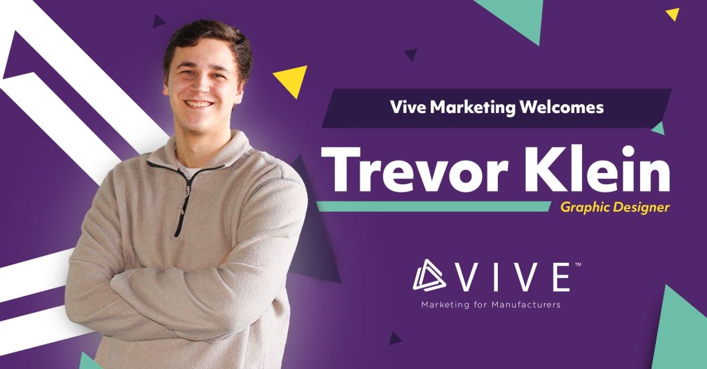
I entered Vive’s newest color into the mix: yellow.
The post that announced me as Vive’s newest employee was the first time yellow would be used within our brand. From that point on, it has remained a staple color in almost all our deliverables.
Social Media Marketing – Style & Hierarchy
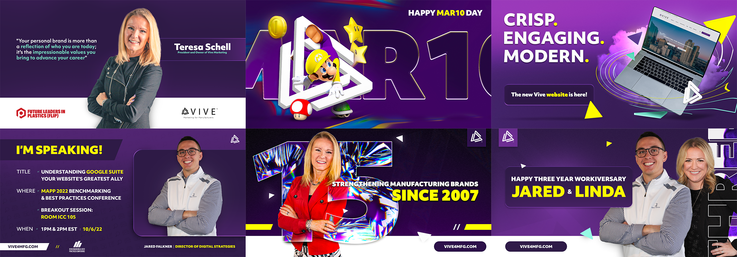
Once the colors were situated, it was the perfect time to formulate Vive’s style. This also was another aspect of our identity that didn’t change with the flip of a switch. However, many of the changes that were made in the beginning of my journey here were stepping stones for what would later ultimately define our brand. Changes such as a greater emphasis on hierarchy, usage of new geometry, layering, shadows, and selective use of our colors made Vive carry itself with a much different weight. As I grew in my position, I identified new opportunities to push different design aesthetics across our deliverables which really gave us the unique look we had been looking for.
Illustrated below, Vive’s social media posts gradually changed but continued to evolve throughout the year. These are great examples of where the boundaries were pushed in our many branding deliverables.
What’s Next for the Marketers in Manufacturing?
Vive’s evolved look and feel expand far beyond social media. Everything front-facing, as well as every internal deliverable all needs to follow suit with the look and feel that’s made its way onto our social media channels. Even though the public isn’t always seeing these final products, it’s still crucial that they retain the same standards that we set for our social posts.
As time marches on, so will the development of Vive’s internal brand. New decisions will be made, new design aesthetics will be tested, and new forms of success will be discovered. Rest assured each and every one of them will feel right at home.
Does your business need a refreshed look? What about an updated brand standards guide for all of its forward-facing marketing deliverables? Contact our team today! We’re eager to have a lasting fingerprint on your brand.
